Global branding begs for attention to particulars. Each part has an impact on consumer feelings and ideas, ranging from the colors and forms to the typefaces used in a brand’s emblem. Therefore, by gaining insight into psychological theories behind design decisions, companies may enhance consumer bonding with them which leads to loyalty as well as increased earnings. This paper examines how colors affect buyers’ minds and how they can be applied by producers so that more successful branding is achieved.
The Power of Colour
Branding is one of the most powerful aspects of color. It can stir up feelings, send out signs, and even modify how people shop for things. Various shades can elicit diverse responses from one’s mind as follows:

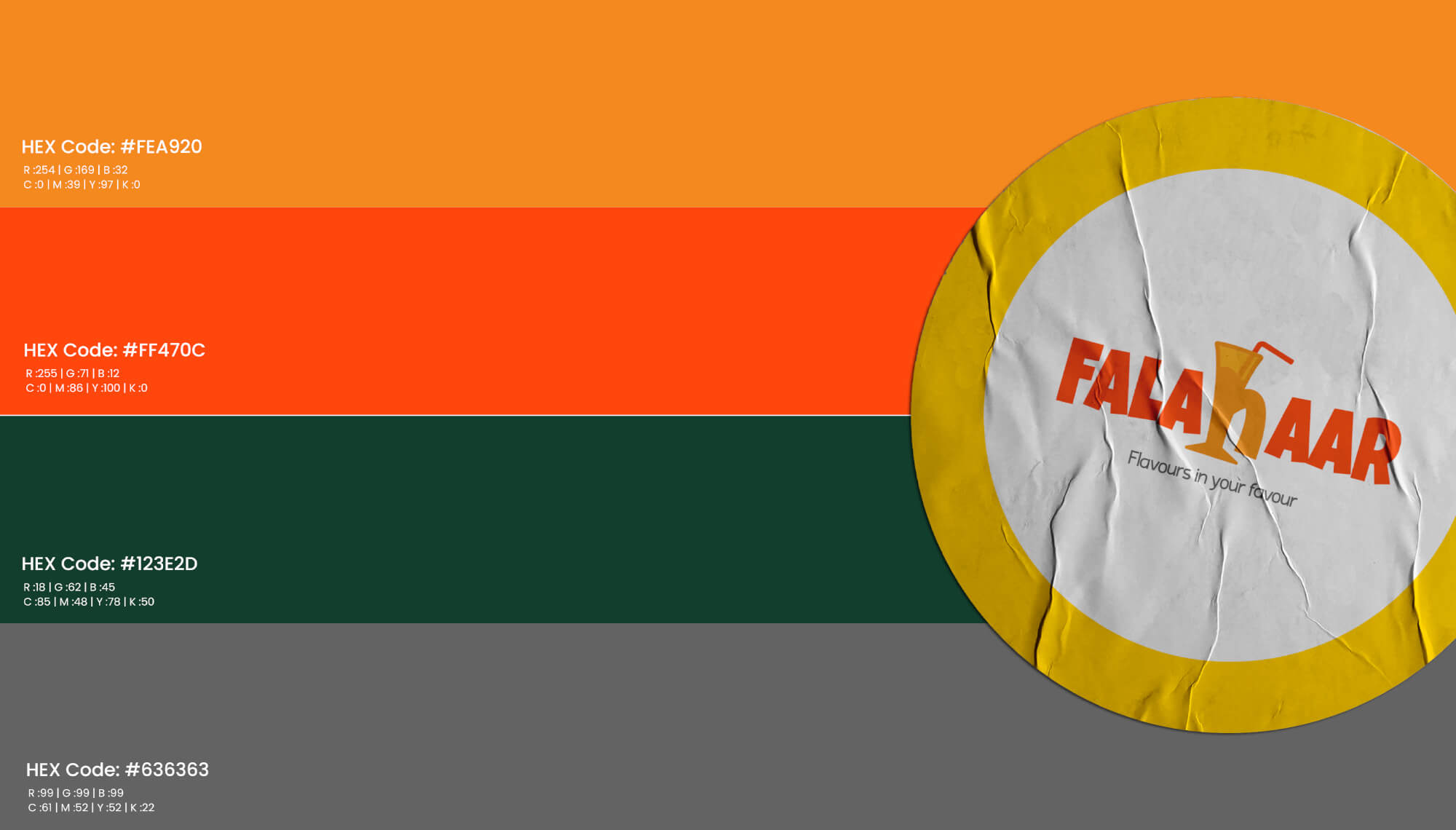
- Red: Associated with excitement, passion and urgency, red can stimulate appetite and is used a lot in the food industry.
- Blue: Evoking feelings of trust, calmness and professionalism, blue is frequently found in corporate and tech branding.
- Green: Popular among brands related to wellness and the environment green symbolizes nature, health and tranquility.
- Yellow: Representing happiness, optimism and warmth yellow can grab attention as well as evoke positive emotions
- Black: Black conveys sophistication, luxury, and power. It’s often used by high-end brands to create a sense of exclusivity.
In a bid to find a color palette that matches their value systems and appeals to the target market segment, companies must be knowledgeable about how colors affect human perception.

The Shape of Things
The shape of things is quite significant. The size of an object can make a person feel different emotions. Colors may be thought of as symbols because they are known to carry with them an amount of good and bad things. As such, this text tries to elaborate on how different shapes are used to communicate with the public in relation to products: Circles and ovals represent unity, harmony and protection; these are some of the reasons why they offer community-oriented brands more friendliness.
Squares or rectangles standing for stability, reliability and order hint at professionalism while at the same time conveying strength. Triangular shapes symbolize stability (when straight up) but they also can denote dynamism or movement (when turned upside down). This creates a greater impression of advancement or creativity in ideas implied by use of them. Organic forms convey a sense of individualism, creativity as well as human touch through irregularly shaped objects; hence many companies that want to be seen as approachable and unique prefer using them.

The Typeface Tells a Story
Typography is another important factor in branding. The typeface a brand chooses encapsulates a whole alphabet of messages and feelings:
Serif Fonts: Conventional and traditional serif fonts imply faithfulness, power and honour. They are commonly used by organisations which want to be seen as already established and genuine.
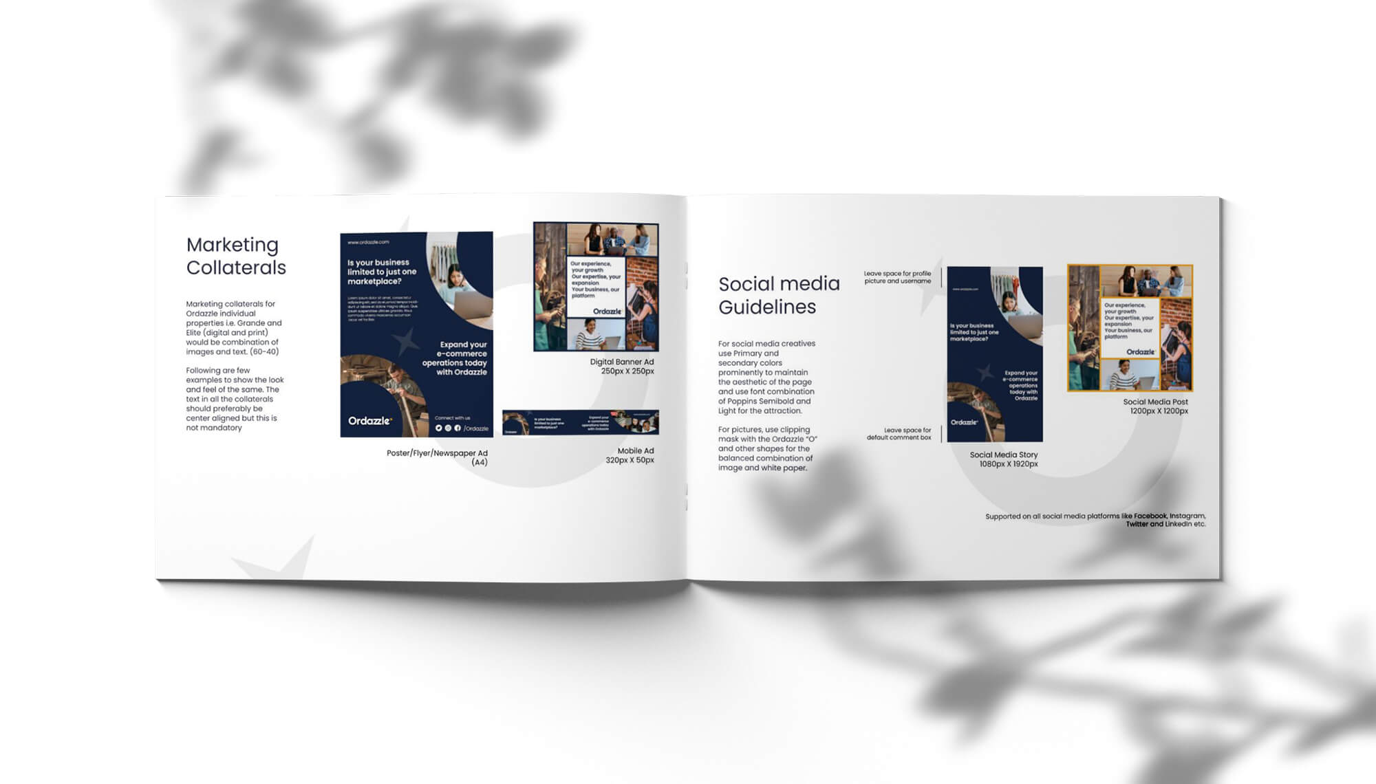
Sans-Serif Fonts: New-fangled, clean sans-serif fonts denote simplicity, clearness, efficaciousness etcetera. They normally attract technological companies or any other brands seeking modernity.
Script Fonts: With their elegance and personal touch script letters can refer to artistry, femininity and opulence. These kinds of fonts are mostly found in fashion as well as cosmetics companies.
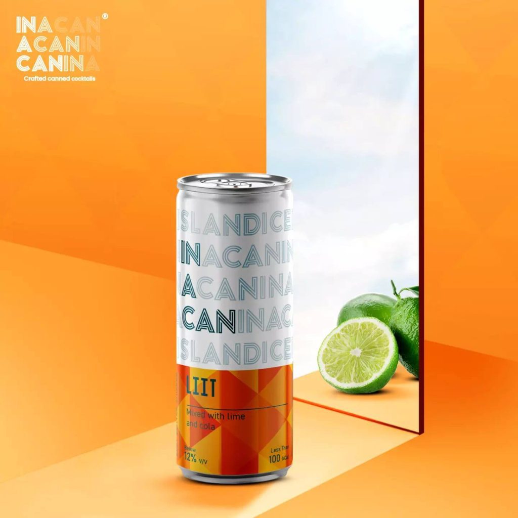
Display Fonts: Strange in appearance with a lot of drawing so that these ones can grab your attention instantly while still being able to stand out when placed against different backgrounds. Such brands should use them if they crave for boldness or memorability.
The selection of an appropriate typeface can work to amplify a brand’s identity while assisting in communicating the desired information to its target market.
Bringing It All Together
A logo that looks great is not everything for a brand. There should be a unique optical self that relates to potential clients’ feelings and expresses what the brand stands for . It is through the study of colors, shapes and font types that brands might design smartly and be consistent with their branding strategies.
At Brands Jar, we use these psychological principles to provide branding services that are not only convincing but also functional. Whether you want to change the old one or start a new one, we have experts who can assist you achieve this. Connect with us now and find out how we can help you build an unmistakable brand.


